10 KiB
Y—Catalog-Viewer
A standalone catalog viewer package that intelligently displays design components.
Sample code to display built-in components
A user can use built-in components like Iconography Category, Font Category, and Color Category to display icons, fonts, and colors respectively.
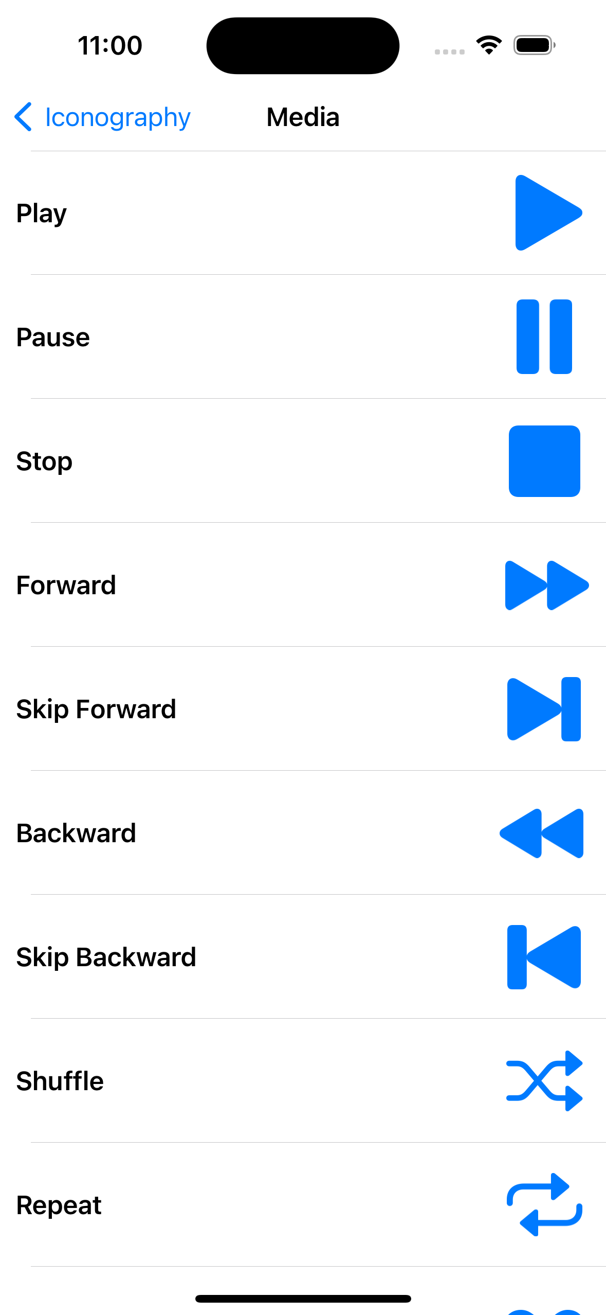
For example, a user can create an iconography category as follows:
   static var media: IconographyCategory {
       IconographyCategory(
           name: "Media",
           models: [
               .init(
                   title: "Play",
                   model: UIImage(systemName: "play.fill") ?? UIImage()
               ),
           ]
       )
   }
}
where the user needs to provide the following parameters:
-
The name of the category.
-
Model for the image to be displayed, which again includes:
- The title label for the image.
- model which is an image to be displayed.
- The detail label which is an optional parameter, allows a user to include additional details about the image if needed.
- The axis attribute which is an optional parameter with which a user can decide whether they want to display the title, details, and image to be displayed vertically or horizontally.
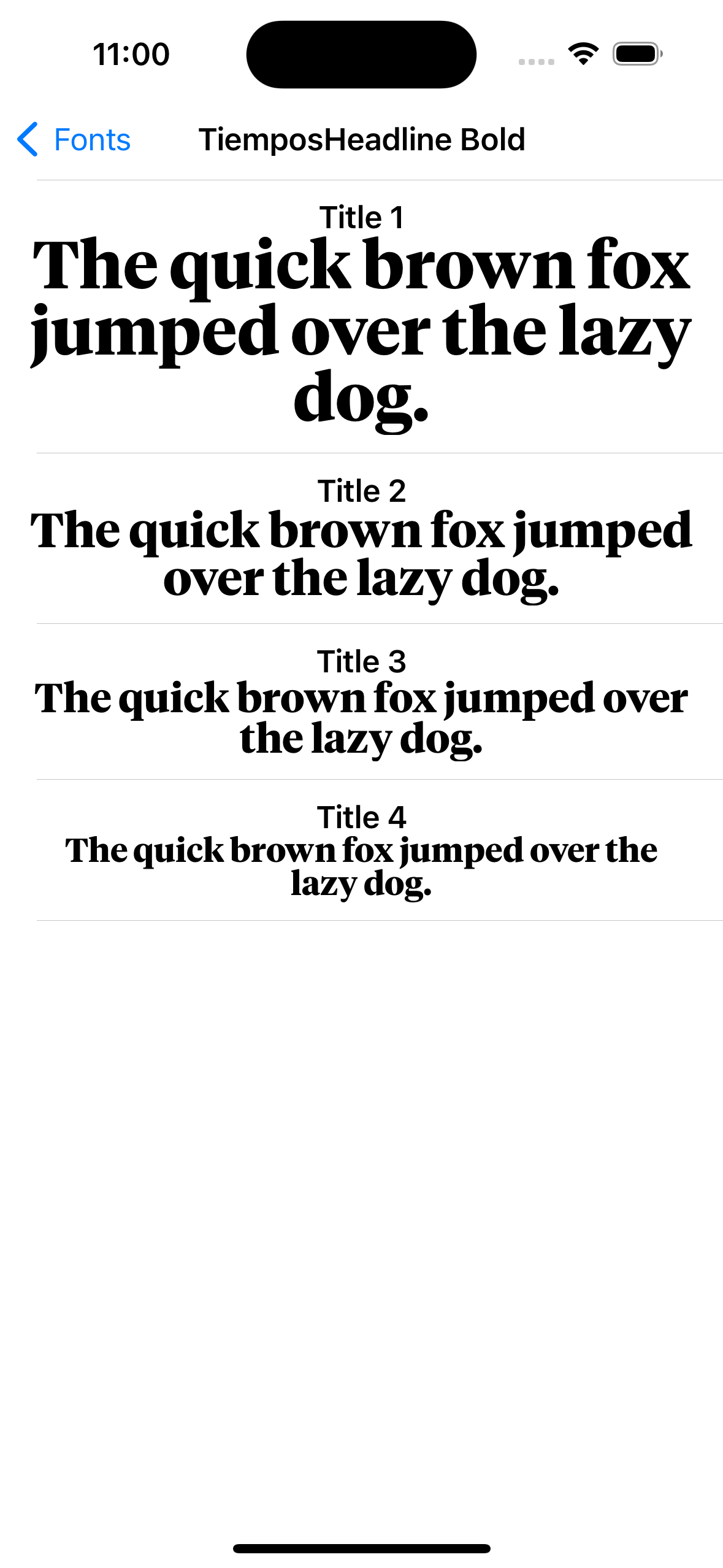
a user can create a font category as follows:
enum FontSample {
   static var tiemposHeadlineBold: FontCategory {
       FontCategory(
           name: "TiemposHeadline Bold",
           models: [
               .init(
                   title: "Title 1",
                   axis: .vertical,
                   model: .init(font: UIFont(name: "TiemposHeadline-Bold", size: 36) ?? UIFont())
               ),
           ]
       )
   }
}
where the user needs to provide the following parameters:
-
The name of the category.
-
Model for the font to be displayed, which again includes:
- The title label to display the content.
- model which is the font for the title and detail label.
- The detail label which is an optional parameter, allows a user to display additional details if needed.
- The axis attribute which is an optional parameter with which a user can decide whether they want to display the title and details to be displayed vertically or horizontally.
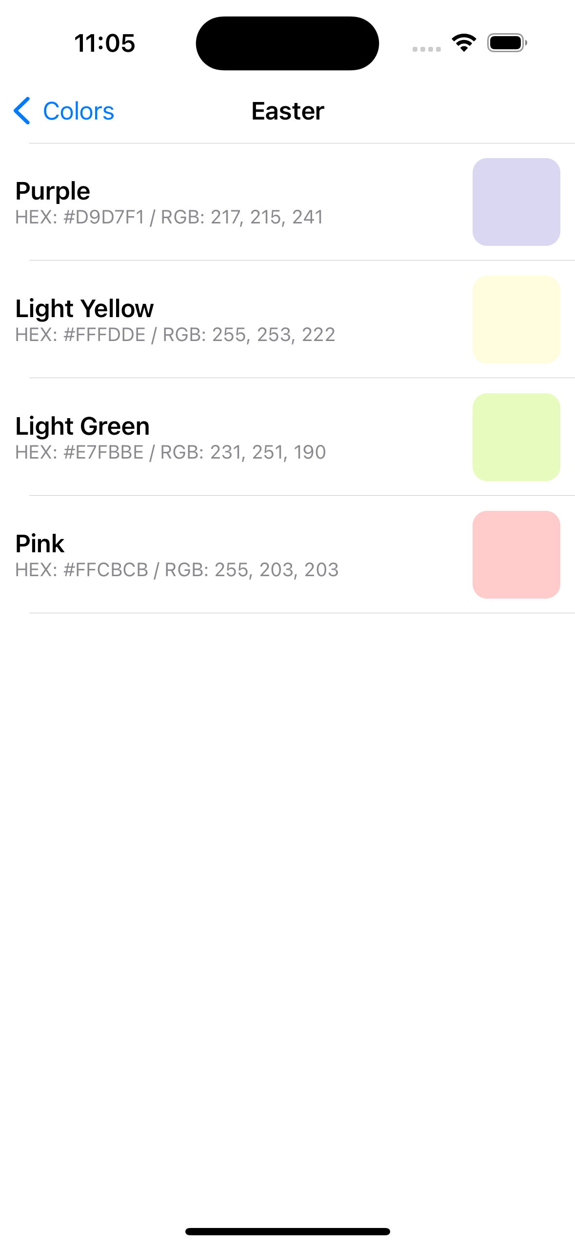
a user can create a color category as follows:
enum ColorSample {
   static var colorSample: ColorCategory {
       ColorCategory(
           name: "Easter",
           models: [
               .init(
                   title: "Purple",
                   detail: "HEX: #D9D7F1 / RGB: 217, 215, 241",
                   model: UIColor(red: 217/255, green: 215/255, blue: 241/255, alpha: 1)
           )
           ]
       )
   }
}
where the user needs to provide the following parameters:
- The name of the category.
- Model for the view to be displayed, which again includes:
- The title label to display the content.
- model which is the color of the color view.
- The detail label which is an optional parameter, allows a user to display additional details if needed.
- The axis attribute which is an optional parameter with which a user can decide whether they want to display the title, details and color view to be displayed vertically or horizontally.
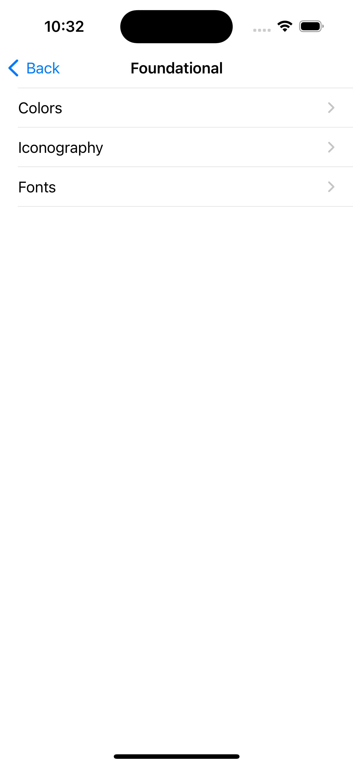
We can create a category which contains other categories.
 let foundationalCategory = CatalogCategory(
            name: "Foundational",
            subcategories: [
                ColorSample.category,
                IconographySample.category,
                FontSample.category
            ]
        )
where the user needs to provide the following parameters:
- The name of the category.
- Array of subcategories.
Sample code to display Custom Components
We can use Custom Category to display components like buttons, views within design system
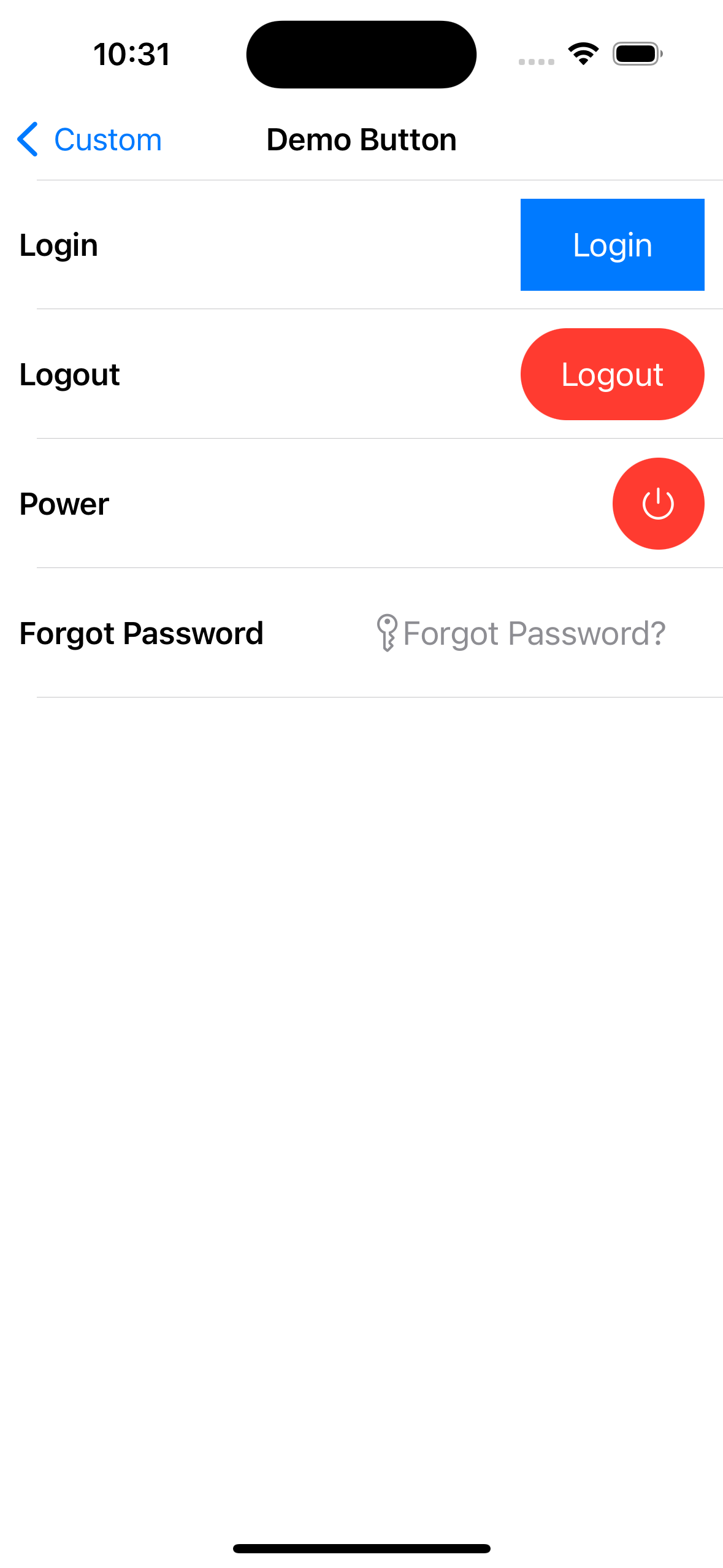
Suppose a user wants to display a button named DemoButton from their project.
enum DemoButtonSample {
    static var demoButtonCategory: CustomCategory<CatalogDisplayView<DemoButton>> {
        CustomCategory<CatalogDisplayView<DemoButton>>(
            name: "Demo Button",
            models: [
                .init(
                    title: "Login",
                    model:
                            .init(
                                backgroundColor: .systemBlue,
                                title: "Login",
                                titleColor: .white
                            )
                ),
            ]
        )
    }
}
where the user needs to provide the following parameters:
- name for the category.
- model needed to initialise the button.
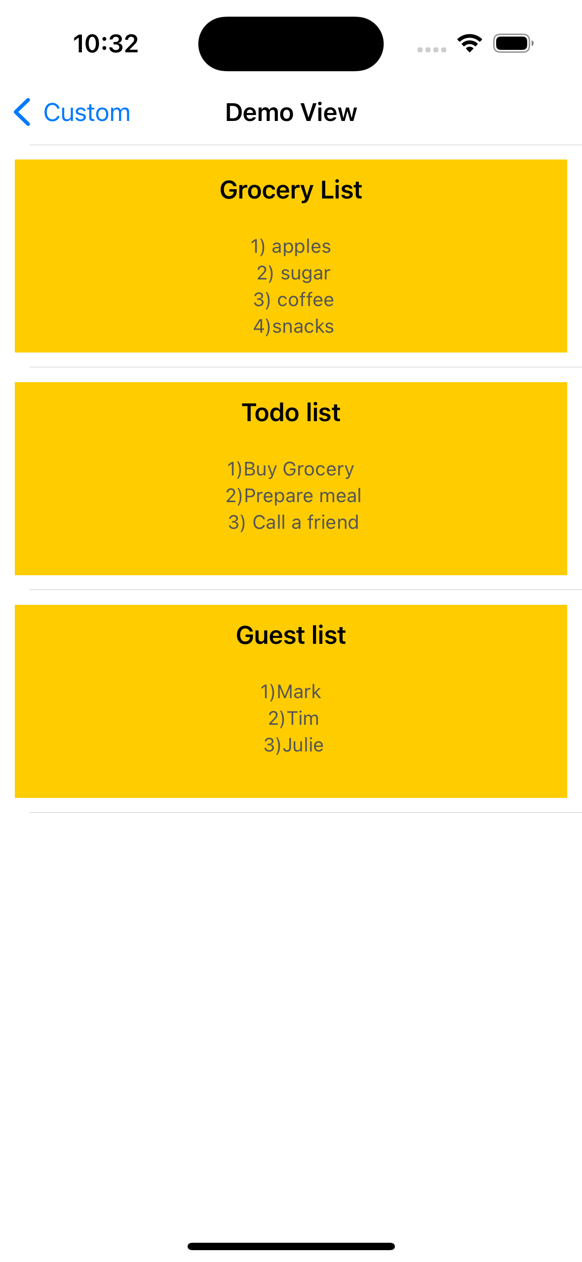
We can display a custom view within the catalog. Suppose a user wants to display a custom view named DemoView from their project.
enum DemoViewSample {
   static var demoViewCategory: CustomCategory<DemoView> {
       CustomCategory<DemoView>(
           name: "Demo View",
           models: [
               .init(
                   title: "Grocery List",
                   description: "1) apples\n 2) sugar\n 3) coffee\n 4)snacks",
                   backgroundColor: .systemYellow
               )
           ]
       )
   }
}
where the user needs to provide the following parameters:
- name for the category.
- model needed to initialise the custom view.
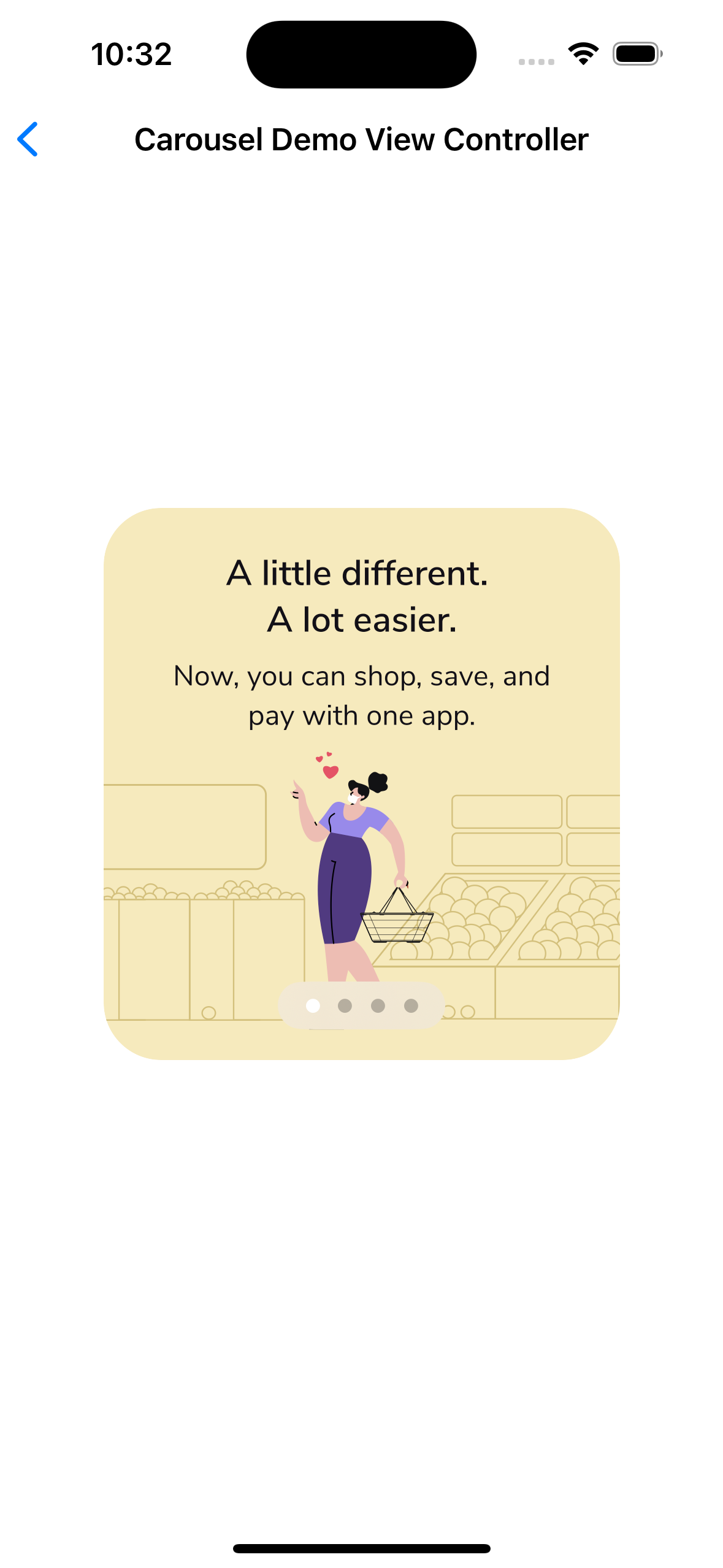
We can display view controllers in the catalog
- First create a custom destination that returns the view controller
struct CarouselDestination: Destination {
   var navigationTitle: String?

   var presentationStyle: Presentation = .detail

   func getDestinationController() -> UIViewController {
       return CarouselDemoViewController(navigationTitle: navigationTitle ?? "")
   }

   init(presentationStyle: Presentation = .detail, navigationTitle: String) {
       self.presentationStyle = presentationStyle
       self.navigationTitle = navigationTitle
   }
}
- Create a custom category for that particular view controller
struct CarouselCategory: Classification {
    let name: String

    var destination: Destination {
        CarouselDestination(navigationTitle: name)
    }

    init(name: String) {
        self.name = name
    }
}
- Create instance of the category
enum CarouselSample {
   static var category: CarouselCategory {
       .init(name: "Carousel Demo View Controller")
   }
}
Contributing to Y—Catalog-Viewer
Versioning strategy
We utilize semantic versioning.
{major}.{minor}.{patch}
e.g.
1.0.5
Branching strategy
We utilize a simplified branching strategy for our frameworks.
- main (and development) branch is
main - both feature (and bugfix) branches branch off of
main - feature (and bugfix) branches are merged back into
mainas they are completed and approved. maingets tagged with an updated version # for each release
Branch naming conventions:
feature/{ticket-number}-{short-description}
bugfix/{ticket-number}-{short-description}
e.g.
feature/CM-44-button
bugfix/CM-236-textview-color
Pull Requests
Prior to submitting a pull request you should:
- Compile and ensure there are no warnings and no errors (this includes warnings from SwiftLint).
- Run all unit tests and confirm that everything passes.
- Check unit test coverage and confirm that all new / modified code is fully covered.
- Run
jazzyfrom the command line and confirm that you have 100% documentation coverage. - Consider using
git rebase -i HEAD~{commit-count}to squash your last {commit-count} commits together into functional chunks. - If HEAD of the parent branch (typically
main) has been updated since you created your branch, usegit rebase mainto rebase your branch.- Never merge the parent branch into your branch.
- Always rebase your branch off of the parent branch.
When submitting a pull request:
- Use the provided pull request template and populate the Introduction, Purpose, and Scope fields at a minimum.
- If you're submitting before and after screenshots, movies, or GIF's, enter them in a two-column table so that they can be viewed side-by-side.
When merging a pull request:
- Make sure the branch is rebased (not merged) off of the latest HEAD from the parent branch. This keeps our git history easy to read and understand.
- Make sure the branch is deleted upon merge (should be automatic).
Releasing new versions
- Tag the corresponding commit with the new version (e.g.
1.0.5) - Push the local tag to remote
Requirements
Jazzy (documentation)
sudo gem install jazzy
Setup
Open Package.swift in Xcode.
Generating Documentation (via Jazzy)
You can generate your own local set of documentation directly from the source code using the following command from Terminal:
jazzy
This generates a set of documentation under /docs. The default configuration is set in the default config file .jazzy.yaml file.
To view additional documentation options type:
jazzy --help
(Once this repo is made public) A GitHub Action automatically runs each time a commit is pushed to main that runs Jazzy to generate the documentation for our GitHub page at: https://yml-org.github.io/ycatalogviewer-ios/