340 lines
12 KiB
Markdown
340 lines
12 KiB
Markdown

|
|
[](https://swiftpackageindex.com/yml-org/YComponentBrowser) [](https://swiftpackageindex.com/yml-org/YComponentBrowser)
|
|
_Easily extend any project to include an intelligent design component browser._
|
|
|
|
Licensing
|
|
----------
|
|
Y—Component Browser is licensed under the [Apache 2.0 license](LICENSE).
|
|
|
|
<img src="https://user-images.githubusercontent.com/1037520/194286091-50f70e8b-940e-47de-ba87-1484121047db.gif" width="414" />
|
|
|
|
Documentation
|
|
----------
|
|
Documentation is automatically generated from source code comments and rendered as a static website hosted via GitHub Pages at: https://yml-org.github.io/YComponentBrowser/
|
|
|
|
## Table of Contents
|
|
* [Usage](#usage)
|
|
* [Color Category](#color-category)
|
|
* [Font Category](#font-category)
|
|
* [Icon Category](#icon-category)
|
|
* [Catalog Category](#catalog-category)
|
|
* [Small Component Category](#small-component-category)
|
|
* [Medium Component Category](#medium-component-category)
|
|
* [Large Component Category](#large-component-category)
|
|
* [Contributing to Y—Component-Browser](#contributing-to-ycomponent-browser)
|
|
* [Versioning Stratergy](#versioning-strategy)
|
|
* [Branching Stratergy](#branching-strategy)
|
|
* [Branching Naming Conventions](#branch-naming-conventions)
|
|
* [Pull Requests](#pull-requests)
|
|
* [Releasing New Versions](#releasing-new-versions)
|
|
* [Requirements](#requirements)
|
|
* [SwiftLint (linter)](#swiftlint-linter)
|
|
* [Jazzy (documentation)](#jazzy-documentation)
|
|
* [Setup](#setup)
|
|
* [Generating Documentation (via Jazzy)](#generating-documentation-via-jazzy)
|
|
|
|
Usage
|
|
----------
|
|
A category is a collection of components that share common traits. A category may contain subcategories. By default, components are laid out in nested table views, with each component being represented by a single row. A `CatalogDisplayView` is used to display a component in a single row. It displays small components together with a title and optional detail description. This is used for icons, fonts, and colors, but also works well for smaller components such as buttons. By using generics, `CatalogDisplayView` can display any view (populated with an associated model). The framework includes pre-defined categories for displaying common components: colors, fonts, and icons.
|
|
|
|
The catalog display view model has four parameters:
|
|
|
|
* `title`: title
|
|
* `detail`: detail description (optional), defaults to `nil`
|
|
* `axis`: primary axis for the content view, defaults to `.horizontal`
|
|
* `model`: model to populate the content view
|
|
|
|
By using `CustomCategory`, a larger component, such as a card view, can be shown. Each custom component might occupy a full row by itself.
|
|
|
|
For even larger components such as a view controller, we may skip the table view controller and display the component on a full screen by itself. This is accomplished by defining a custom category and destination that conform to the `Classification` and `Destination` protocols, respectively.
|
|
|
|
### Color category
|
|
We can display colors by declaring a `ColorCategory` object:
|
|
```
|
|
let category = ColorCategory(
|
|
name: "Easter",
|
|
models: [
|
|
.init(
|
|
title: "Purple",
|
|
detail: "HEX: #D9D7F1",
|
|
model: UIColor(red: 217/255, green: 215/255, blue: 241/255, alpha: 1)
|
|
),
|
|
.init(
|
|
title: "Light Yellow",
|
|
detail: "HEX: #FFFDDE",
|
|
model: UIColor(red: 1, green: 253/255, blue: 222/255, alpha: 1)
|
|
)
|
|
]
|
|
)
|
|
```
|
|
where you need to specify:
|
|
|
|
* `name`: color category name
|
|
* `models`: information about the colors to be displayed
|
|
|
|

|
|
|
|
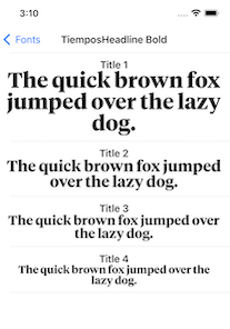
### Font Category
|
|
We can display fonts by declaring a `FontCategory` object:
|
|
```
|
|
let category = FontCategory(
|
|
name: "TiemposHeadline Bold",
|
|
models: [
|
|
.init(
|
|
title: "Title 1",
|
|
model: FontView.Model(
|
|
font: UIFont(name: "TiemposHeadline-Bold", size: 36)!
|
|
)
|
|
),
|
|
.init(
|
|
title: "Title 2",
|
|
model: FontView.Model(
|
|
font: UIFont(name: "TiemposHeadline-Bold", size: 26)!
|
|
)
|
|
)
|
|
]
|
|
)
|
|
```
|
|
where you need to specify:
|
|
|
|
* `name`: font category name
|
|
* `models`: information about the fonts to be displayed
|
|
|
|
|
|
|
|
### Icon Category
|
|
We can display icons by declaring an `IconCategory` object:
|
|
```
|
|
let category = IconCategory(
|
|
name: "Media",
|
|
models: [
|
|
.init(
|
|
title: "Play",
|
|
model: UIImage(systemName: "play.fill")!
|
|
),
|
|
.init(
|
|
title: "Pause",
|
|
model: UIImage(systemName: "pause.fill")!
|
|
)
|
|
]
|
|
)
|
|
```
|
|
where you need to specify:
|
|
|
|
* `name`: icon category name
|
|
* `models`: information about the icons to be displayed
|
|
|
|

|
|
|
|
### Catalog Category
|
|
We can display nested subcategories by declaring a `CatalogCategory` object:
|
|
```
|
|
let category = CatalogCategory(
|
|
name: "Foundational",
|
|
subcategories: [
|
|
ColorSample.category,
|
|
IconSample.category,
|
|
FontSample.category
|
|
]
|
|
)
|
|
```
|
|
where you need to specify:
|
|
|
|
* `name`: category name
|
|
* `subcategories`: array of subcategories
|
|
|
|

|
|
|
|
### Small Component Category
|
|
We can display small custom components (such as buttons) by declaring a `CustomCategory` object that leverages `CatalogDisplayView`:
|
|
```
|
|
let category = CustomCategory<CatalogDisplayView<DemoButton>>(
|
|
name: "Demo Button",
|
|
models: [
|
|
.init(
|
|
title: "Login",
|
|
model: .init(
|
|
backgroundColor: .systemBlue,
|
|
title: "Login",
|
|
titleColor: .white
|
|
)
|
|
),
|
|
.init(
|
|
title: "Logout",
|
|
model: .init(
|
|
backgroundColor: .systemRed,
|
|
cornerRadius: 25,
|
|
title: "Logout",
|
|
titleColor: .white
|
|
)
|
|
),
|
|
]
|
|
)
|
|
```
|
|
where you need to specify:
|
|
|
|
* `name`: category name
|
|
* `models`: information about the components to be displayed (in this case buttons)
|
|
|
|

|
|
|
|
### Medium Component Category
|
|
We can display medium-sized custom components (such as a card or a note) by declaring a `CustomCategory` object that directly uses the view to be displayed:
|
|
```
|
|
let category = CustomCategory<NoteView>(
|
|
name: "Demo View",
|
|
models: [
|
|
NoteView.Model(
|
|
title: "Grocery List",
|
|
body: "1) apples\n 2) sugar\n 3) coffee\n 4)snacks",
|
|
backgroundColor: .systemYellow
|
|
),
|
|
NoteView.Model(
|
|
title: "Todo List",
|
|
body: ""1)Buy Grocery\n 2)Prepare meal\n 3) Call a friend\n "",
|
|
backgroundColor: .systemYellow
|
|
)
|
|
]
|
|
)
|
|
```
|
|
where you need to specify:
|
|
|
|
* `name`: category name
|
|
* `models`: information about the components to be displayed (in this case notes)
|
|
|
|

|
|
|
|
### Large Component Category
|
|
In order to display large custom components (including full-screen views and even view controllers), we need to:
|
|
|
|
1. Create a custom destination that returns a view controller to be presented. If your component is not a view controller, this would be a view controller that contains your component.
|
|
```
|
|
struct CarouselDestination: Destination {
|
|
let navigationTitle: String?
|
|
|
|
let presentationStyle: Presentation = .detail
|
|
|
|
func getDestinationController() -> UIViewController {
|
|
CarouselDemoViewController(navigationTitle: navigationTitle)
|
|
}
|
|
}
|
|
```
|
|
|
|
2. Create a custom category for that particular view controller
|
|
```
|
|
struct CarouselCategory: Classification {
|
|
let name: String
|
|
|
|
var destination: Destination {
|
|
CarouselDestination(navigationTitle: name)
|
|
}
|
|
}
|
|
```
|
|
|
|
3. Declare an instance of the category
|
|
```
|
|
let category = CarouselCategory(name: "Carousel Demo View Controller")
|
|
```
|
|
|
|

|
|
|
|
Contributing to Y—Component-Browser
|
|
----------
|
|
|
|
### Versioning strategy
|
|
|
|
We utilize [semantic versioning](https://semver.org).
|
|
|
|
```
|
|
{major}.{minor}.{patch}
|
|
```
|
|
|
|
e.g.
|
|
|
|
```
|
|
1.0.5
|
|
```
|
|
|
|
### Branching strategy
|
|
|
|
We utilize a simplified branching strategy for our frameworks.
|
|
|
|
* main (and development) branch is `main`
|
|
* both feature (and bugfix) branches branch off of `main`
|
|
* feature (and bugfix) branches are merged back into `main` as they are completed and approved.
|
|
* `main` gets tagged with an updated version # for each release
|
|
|
|
### Branch naming conventions:
|
|
|
|
```
|
|
feature/{ticket-number}-{short-description}
|
|
bugfix/{ticket-number}-{short-description}
|
|
```
|
|
e.g.
|
|
```
|
|
feature/CM-44-button
|
|
bugfix/CM-236-textview-color
|
|
```
|
|
|
|
### Pull Requests
|
|
|
|
Prior to submitting a pull request you should:
|
|
|
|
1. Compile and ensure there are no warnings and no errors (this includes warnings from SwiftLint).
|
|
2. Run all unit tests and confirm that everything passes.
|
|
3. Check unit test coverage and confirm that all new / modified code is fully covered.
|
|
4. Run `jazzy` from the command line and confirm that you have 100% documentation coverage.
|
|
5. Consider using `git rebase -i HEAD~{commit-count}` to squash your last {commit-count} commits together into functional chunks.
|
|
6. If HEAD of the parent branch (typically `main`) has been updated since you created your branch, use `git rebase main` to rebase your branch.
|
|
* _Never_ merge the parent branch into your branch.
|
|
* _Always_ rebase your branch off of the parent branch.
|
|
|
|
When submitting a pull request:
|
|
|
|
* Use the [provided pull request template](PULL_REQUEST_TEMPLATE.md) and populate the Introduction, Purpose, and Scope fields at a minimum.
|
|
* If you're submitting before and after screenshots, movies, or GIF's, enter them in a two-column table so that they can be viewed side-by-side.
|
|
|
|
When merging a pull request:
|
|
|
|
* Make sure the branch is rebased (not merged) off of the latest HEAD from the parent branch. This keeps our git history easy to read and understand.
|
|
* Make sure the branch is deleted upon merge (should be automatic).
|
|
|
|
### Releasing new versions
|
|
* Tag the corresponding commit with the new version (e.g. `1.0.5`)
|
|
* Push the local tag to remote
|
|
|
|
|
|
Requirements
|
|
----------
|
|
|
|
#### SwiftLint (linter)
|
|
```
|
|
brew install swiftlint
|
|
```
|
|
|
|
### Jazzy (documentation)
|
|
```
|
|
sudo gem install jazzy
|
|
```
|
|
|
|
Setup
|
|
----------
|
|
|
|
Open `Package.swift` in Xcode.
|
|
|
|
|
|
Generating Documentation (via Jazzy)
|
|
----------
|
|
|
|
You can generate your own local set of documentation directly from the source code using the following command from Terminal:
|
|
```
|
|
jazzy
|
|
```
|
|
This generates a set of documentation under `/docs`. The default configuration is set in the default config file `.jazzy.yaml` file.
|
|
|
|
To view additional documentation options type:
|
|
```
|
|
jazzy --help
|
|
```
|
|
A GitHub Action automatically runs each time a commit is pushed to `main` that runs Jazzy to generate the documentation for our GitHub page at: https://yml-org.github.io/YComponentBrowser/
|